← All projects

Wooppay

A payments service for merchants — a focused, four-month redesign of the Woopkassa business dashboard.

Years
2020 — 2021
Scope
Merchant dashboard · UX
Role
UI/UX Designer
Wooppay cover

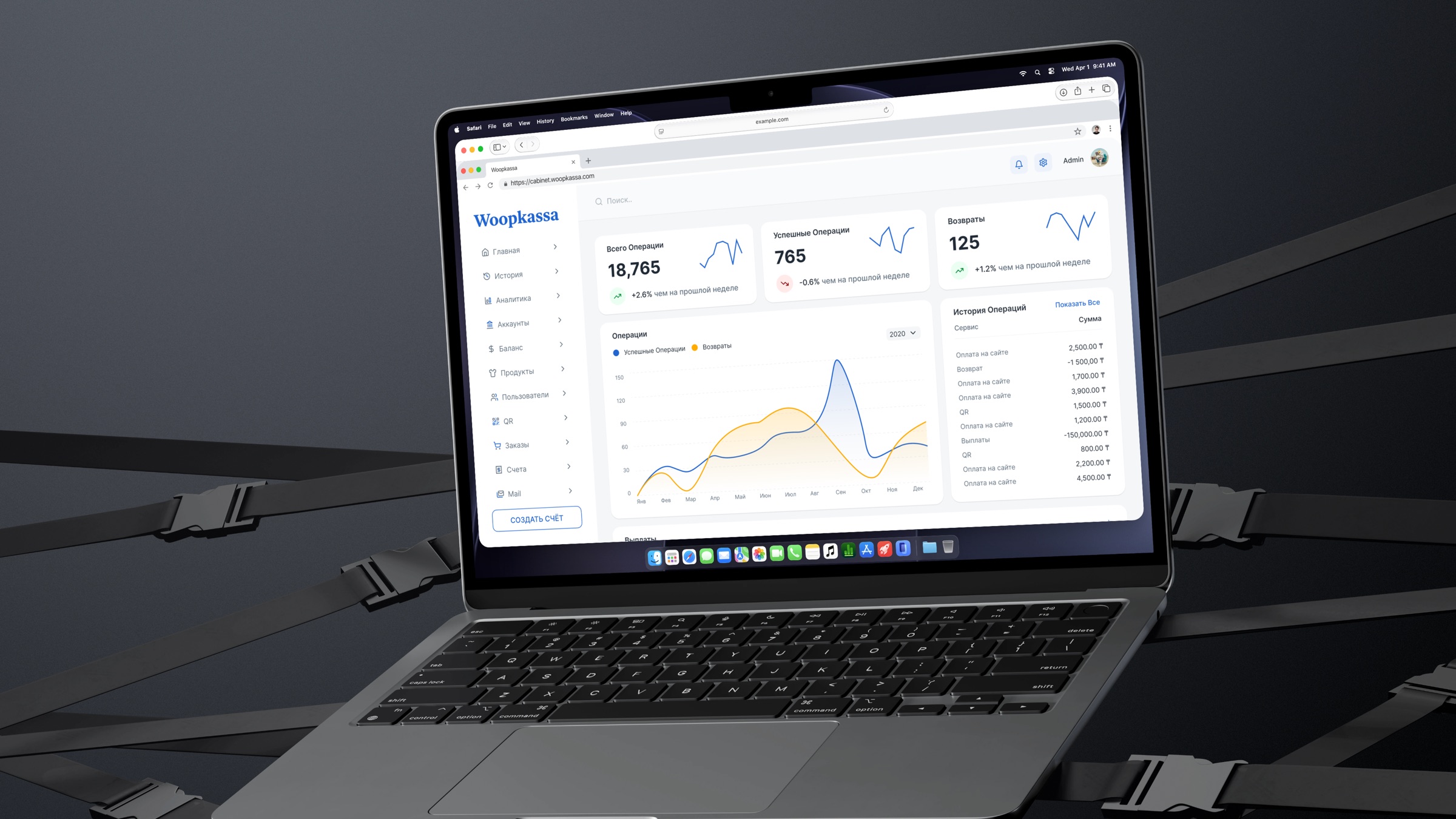
Wooppay is a payments service for merchants and consumers. My part was focused and finite: a four-month engagement redesigning Woopkassa, the dashboard businesses use to track their money day to day.

The users weren't browsing — they were checking figures they rely on. So the work was about readability and order, not reinvention.

UI/UX Designer on the Woopkassa dashboard — the component kit underneath it, the interactive prototypes, and the redesign itself.

The project

Woopkassa — a dashboard for daily reading

Decision

I reorganized the dashboard around the numbers a business checks every day — balance, incoming, settlements — and pushed the rare, administrative controls out of the daily line of sight.

Alternative

Keeping the existing layout and merely restyling it would have looked fresher without fixing the real friction: important figures competing with everything else for attention.

Why

A clearer information hierarchy and calmer typography made the routine check-in fast and unambiguous — the difference between a tool you tolerate and one you trust with your money.

Drag to compare · old → redesign
Groundwork

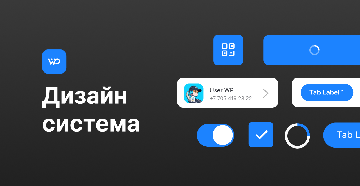
A small design system — built to be clicked

Decision

Before redrawing a single screen I assembled Wooppay's first design system: a type scale, color and spacing tokens, and the dozen components Woopkassa actually runs on — tables, cards, inputs, buttons, status chips. Each one carried its states as variants, not as separate frames: default, hover, focus, disabled, empty, loading, error.

Alternative

On a four-month engagement the quick route is to draw every screen as a picture and hand it over — nothing to maintain, nothing to explain. And every new screen re-decides what a button is.

Why

States as variants made the file prototypable: review stopped being a slideshow and became something you could click, and hand-off already answered “what happens when it’s loading, empty or wrong” before anyone asked. Small on purpose — it covered one product, and it covered it completely.

Artwork pendingComponents and their states
Components and their states

Set up Wooppay's first component kit — tokens, components and their states — and used it to put clickable prototypes in front of review.

Reworked the dashboard's information architecture around daily business tasks.

Improved readability so key figures are legible at a glance.

A small project, honestly scoped — but a reminder that even a four-month redesign earns its keep if it makes a tool people use every day a little clearer.

Let's talk

Have a role or a product in mind? I'm one message away.